Sarah Samarasinghe's Portfolio
Welcome
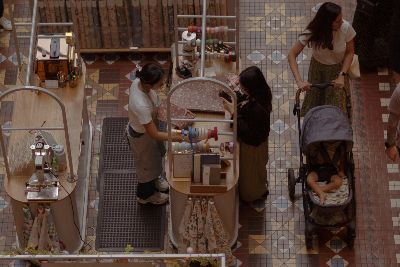
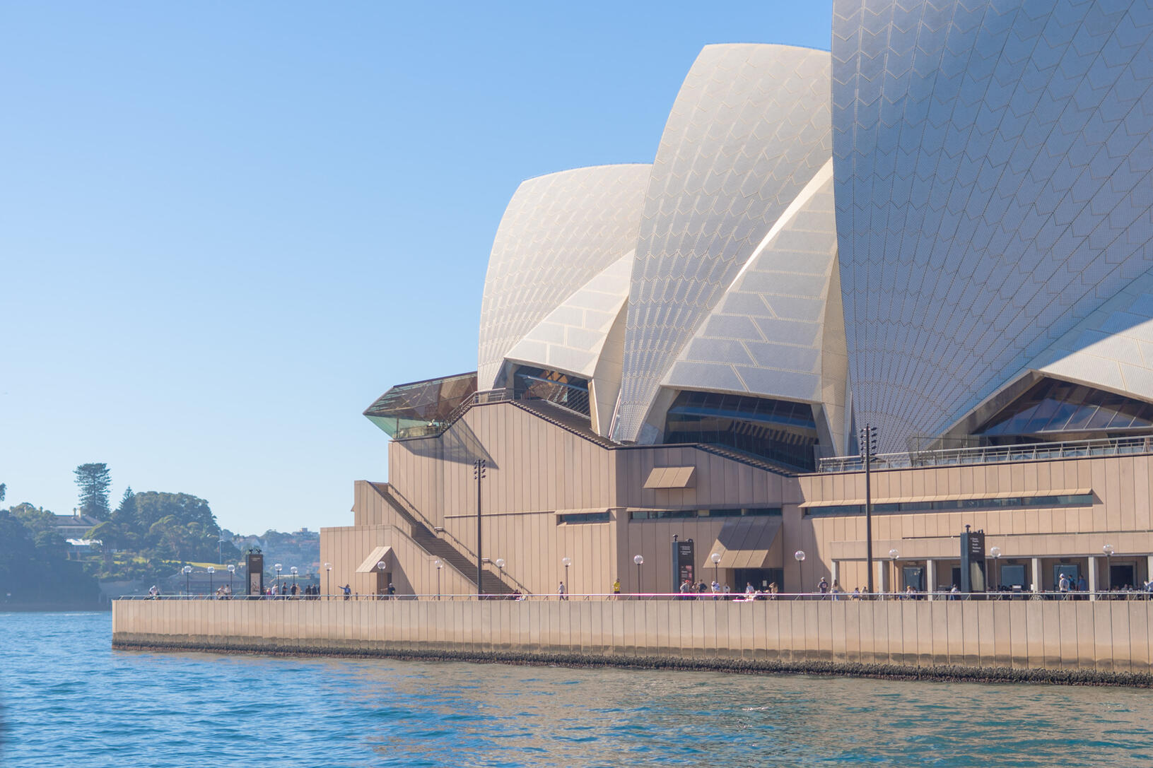
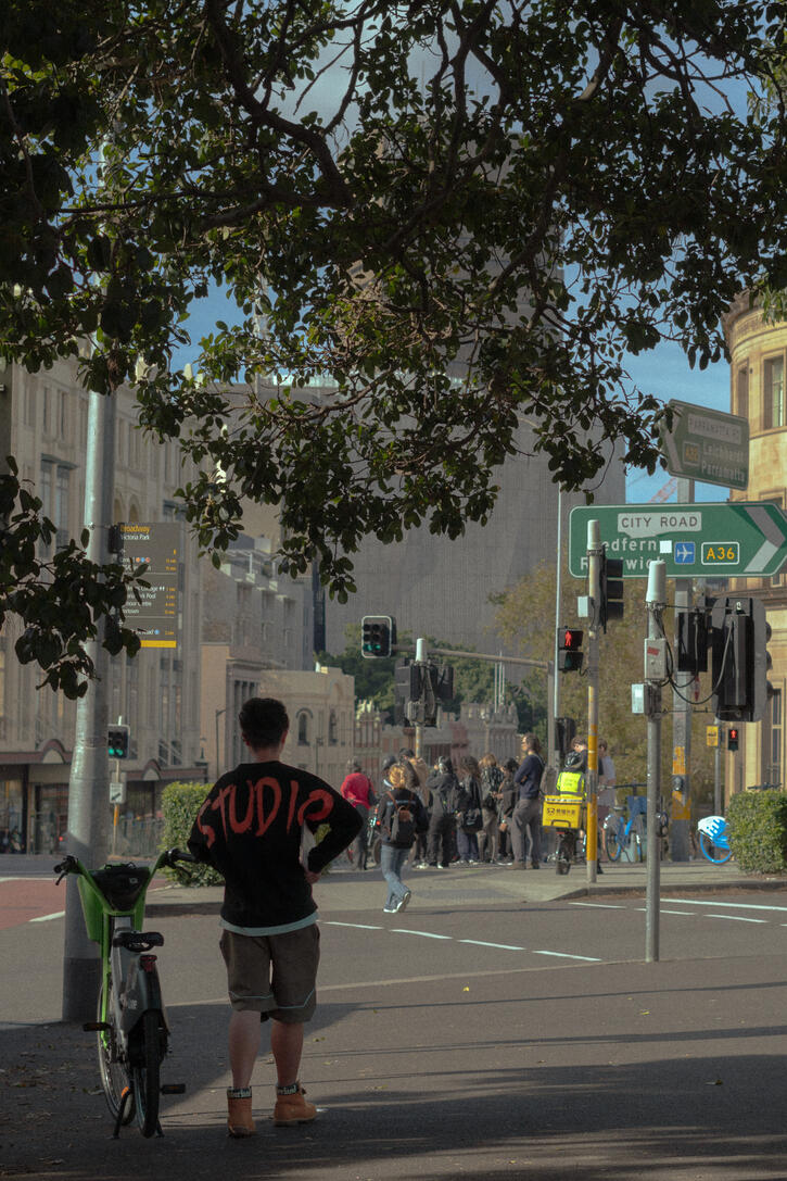
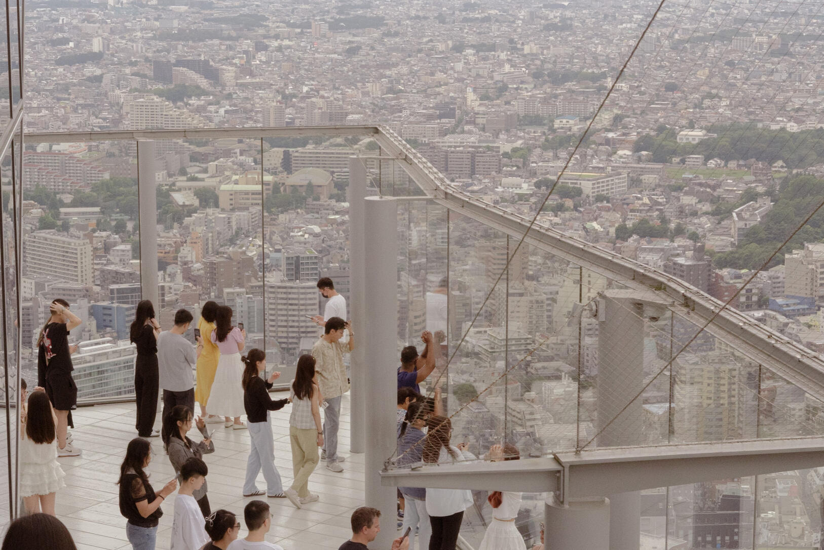
Hi there! I'm Sarah, a designer who likes to build ideas through making. A lot of what I do starts with observation, whether be of people, spaces, or everyday details.
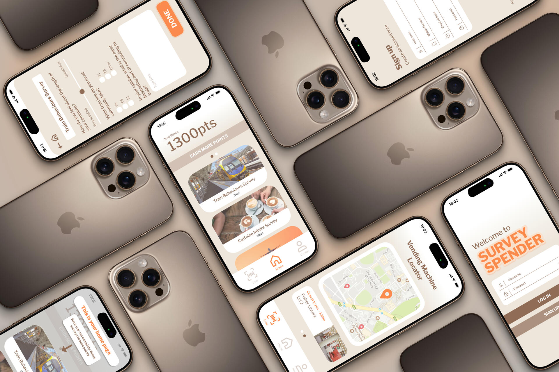
UX/UI Design/Research
I create user-centred digital experiences grounded in research, clear information architecture, and accessible, intuitive interfaces.
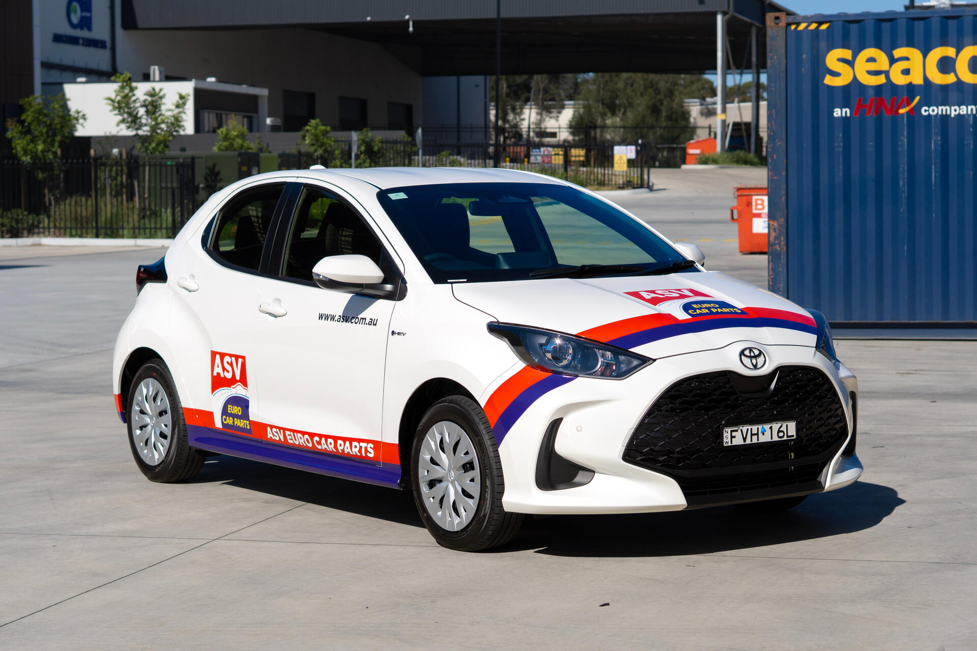
Brand Design/Development
I build cohesive visual identities that communicate purpose, strengthen recognition, and connect meaningfully with target audiences.
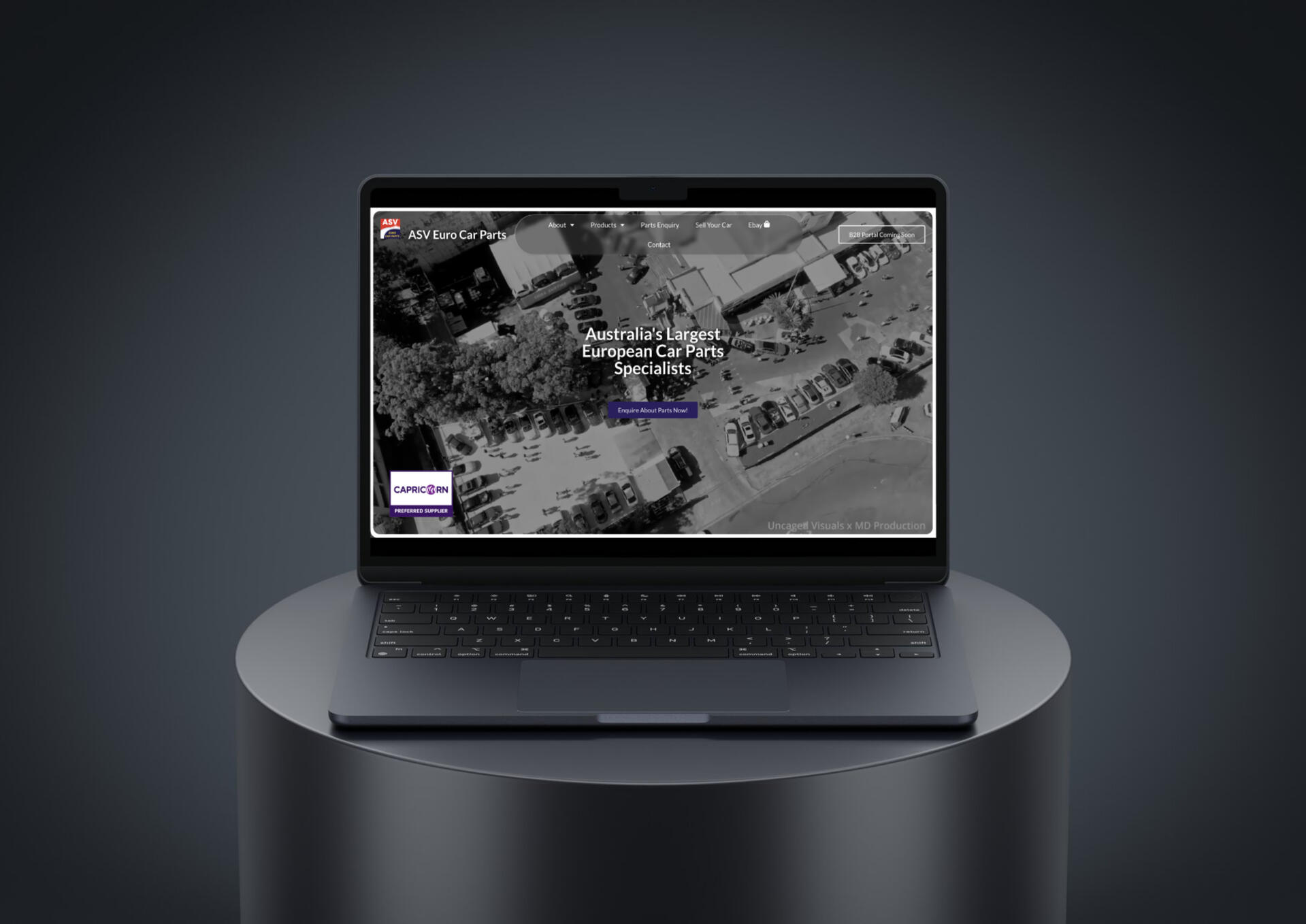
Web Design/Development
I design and develop responsive, functional websites that balance strong aesthetics with seamless usability and performance.
My Toolkit
Illustration, Graphics & Editing
Illustrator

After Effects

Lightroom

Photoshop
Canva

Procreate

CapCut
Web Development & Coding

HTML

Javascript

CSS

Visual Studio Code

Github

WordPress

cPanel

Elementor
3D Modelling & Production

Blender

Unity

Cura

Shapr3D

Twinmotion

Rhino
Fusion 360
User Interface Design & Prototyping

Figma

XD
© Sarah Samarasinghe 2025. All rights reserved.
My Work
© Sarah Samarasinghe 2025. All rights reserved.
ASV Website Design & Development
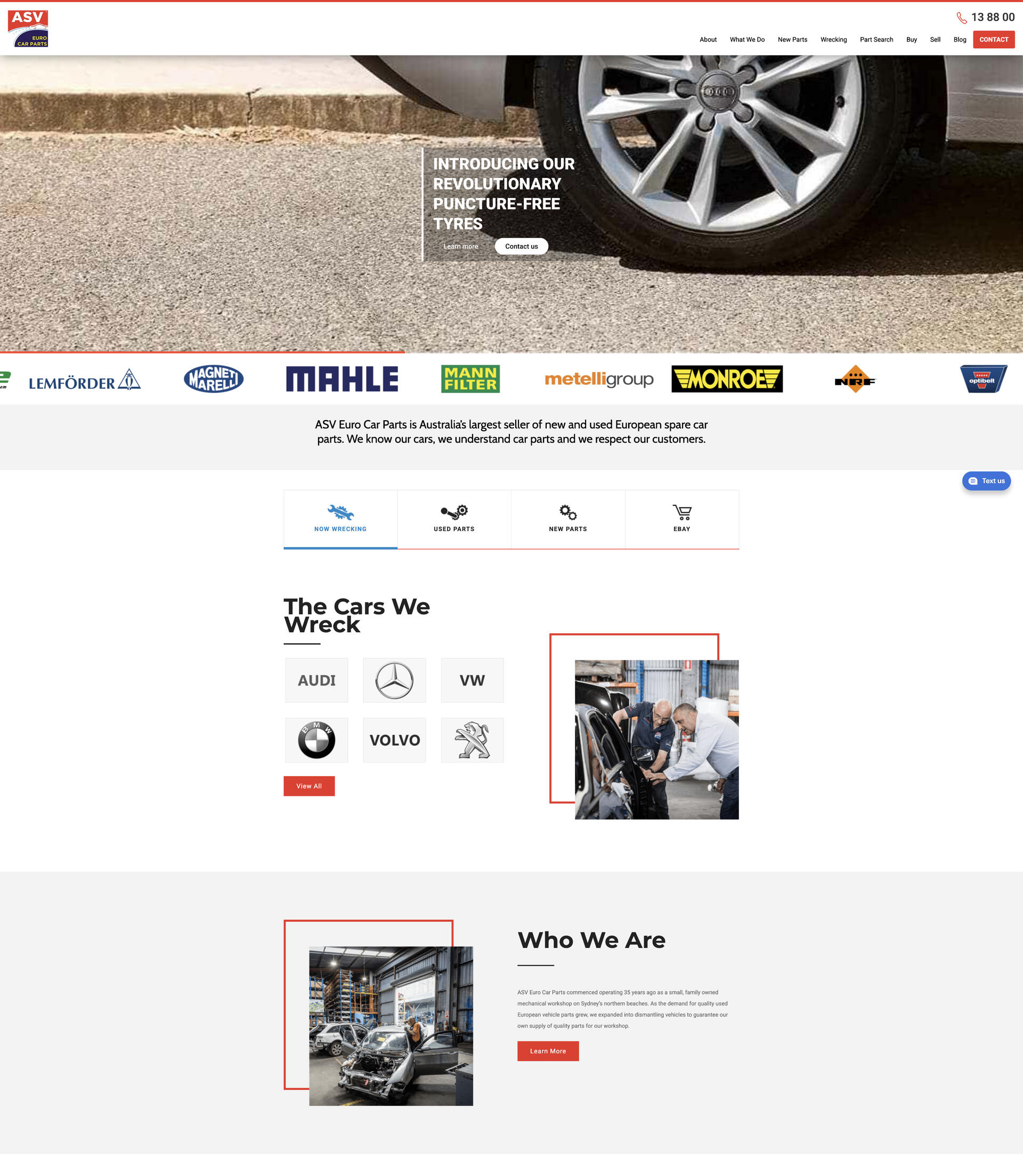
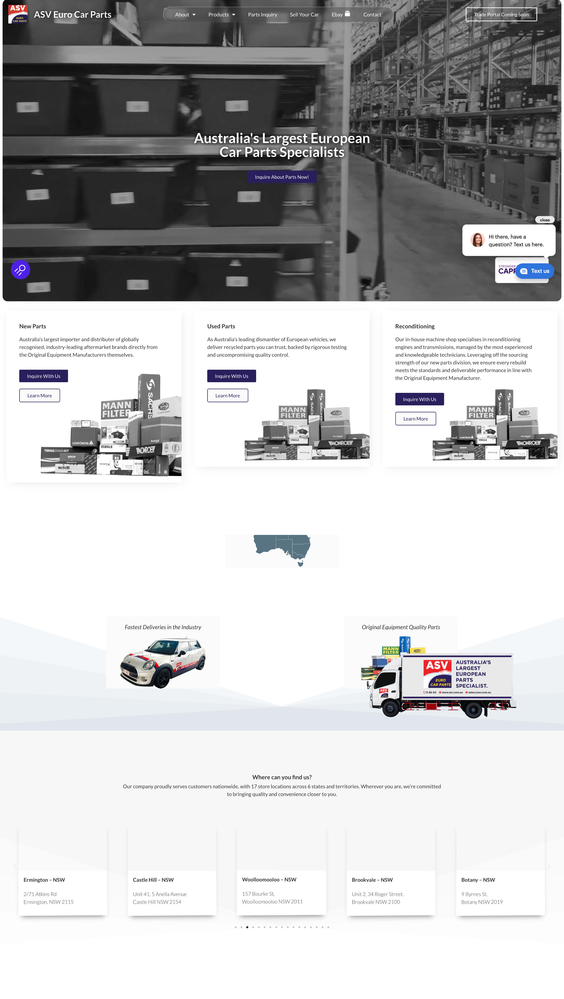
Redesigned and rebuilt ASV’s decade-old website into a modern, high-performing WordPress experience aligned with their brand and business goals.
Role
Web Developer, UI Designer
Tools
Figma,
Wordpress, Elementor, CSS
Deliverables
Responsive Website, Web Prototype
Duration
2 weeks
Context
ASV, a European car parts supplier, needed a complete overhaul of their outdated website to improve traffic, modernise their brand presence, and streamline customer enquiries. The new platform required a secure CMS, easy content management, and room for future expansion across trade and internal portals.
Process & Approach
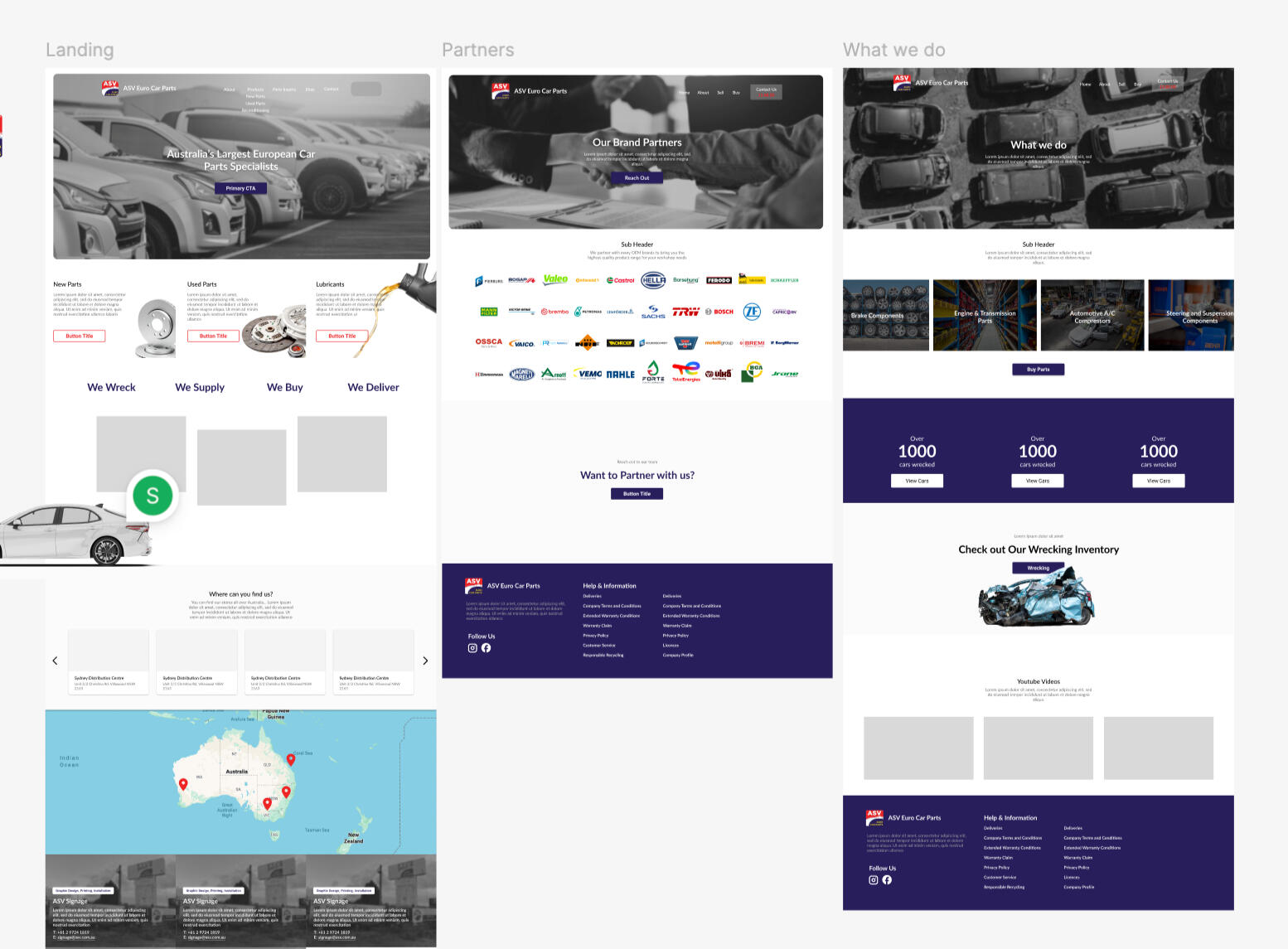
• Designed the full website experience in Figma and presented it to ASV’s leadership for approval.• Developed the site in WordPress using Elementor, building UI components based on a custom visual design system.• Created an engaging video-based landing page, clear calls-to-action, and interactive UI elements that reflect ASV’s corporate identity.• Implemented enquiry forms that route different request types to the correct internal teams.• Built and tested the site on a staging domain before launching and continued optimisation using Microsoft Clarity insights.
Outcome
The redesign significantly increased engagement, achieving 350–500 daily visitors, an average 50% scroll depth, 1.9s LCP, and strong enquiry-to-view ratios. The new site enhances ASV’s credibility, improves customer enquiry flow, and provides a flexible, secure foundation for ongoing digital growth.
Key Learnings

Design–Dev Alignment
A strong design system ensured consistency across UI components during development.

Data-Driven Improvements
Behaviour analytics (scroll depth, heatmaps, form dropout) helped refine usability after launch.

Scalable Architecture
Planning for modular growth made future integrations and portal expansions seamless.
© Sarah Samarasinghe 2025. All rights reserved.
Tava App Design Solution
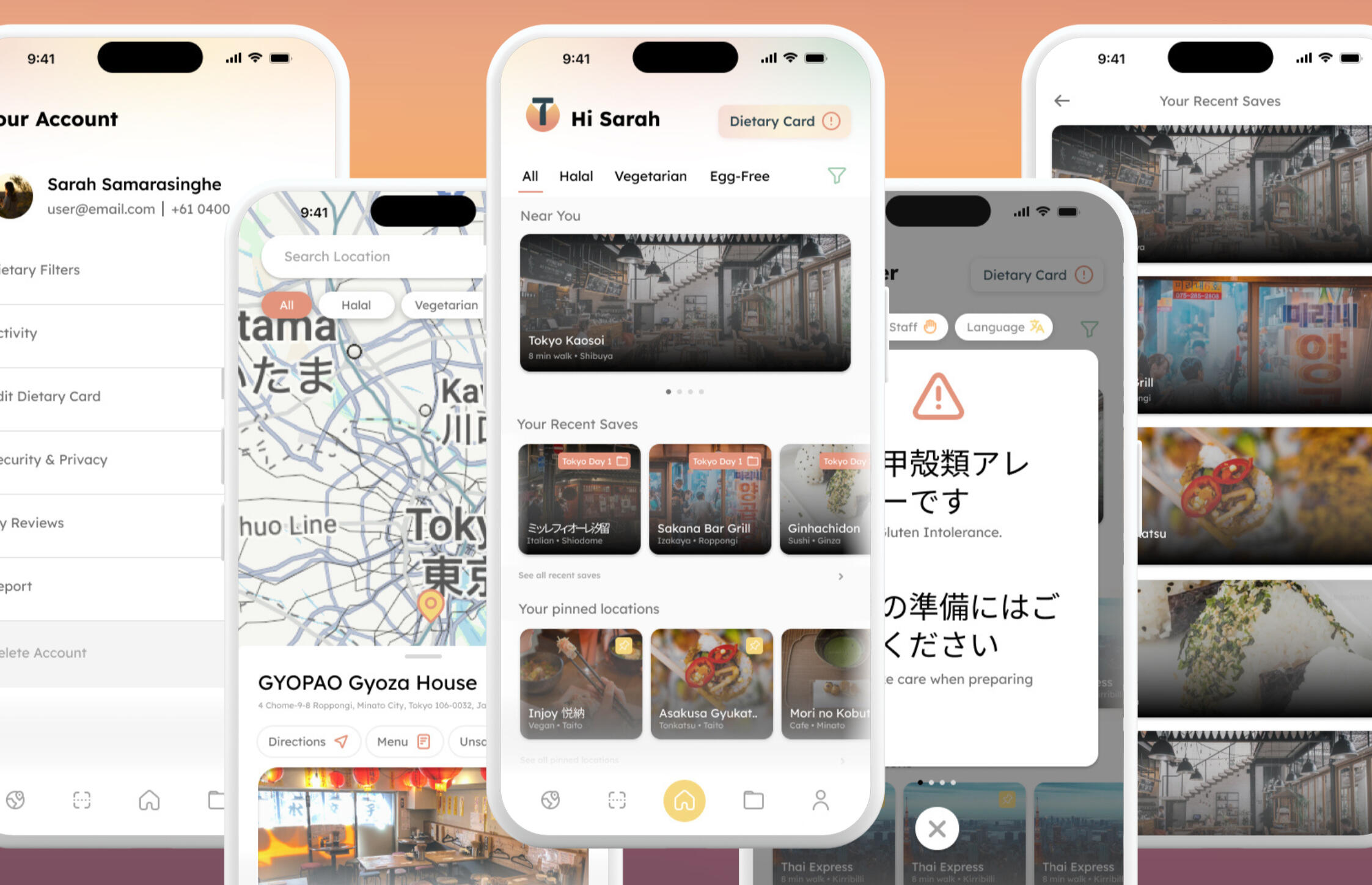
Designed a travel app that helps first-time travellers with dietary requirements find safe, inclusive dining options through real-time guidance, preparation tools, and accessible communication features.
Role
UX Researcher, UI Designer
Tools
Figma
Deliverables
Interactive Prototype, Concept Design & Proposal
Duration
4 weeks
Context
Food is central to cultural participation, yet travellers with dietary needs often face stress, limited options, and communication barriers abroad. Existing online advice is fragmented and unreliable, leaving a gap for a cohesive digital solution that supports safety, confidence, and inclusion. This project explores how UX research can translate these lived challenges into an empowering travel experience.
Process & Approach
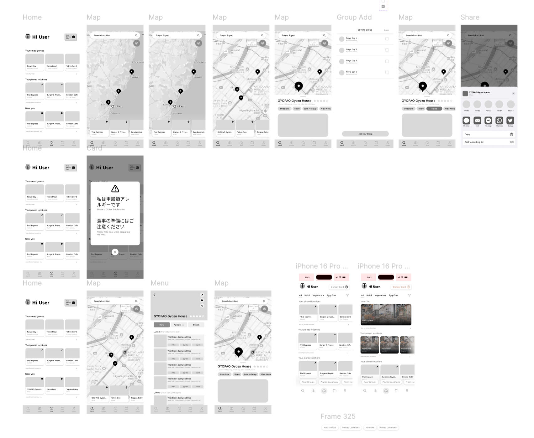
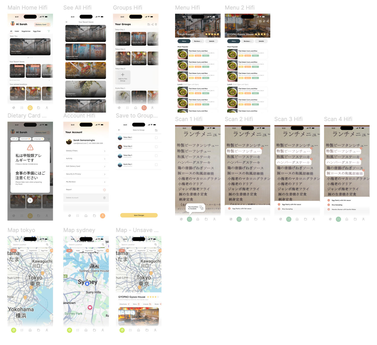
• Conducted an online ethnography of Reddit communities to understand the real-world experiences of dietary-restricted travellers.• Identified key pain points; anxiety around food safety, inconsistent labelling, limited awareness among hospitality staff, and social pressures during shared meals.• Mapped insights into design opportunities focused on preparation, real-time support, and clearer communication.• Designed task flows, wireframes, and interactive prototypes addressing navigation, restaurant discovery, translation, and menu-scanning.• Iterated through testing and refined the IA, clarity of dietary filters, and feedback states to reduce errors and increase user confidence.
Outcome
The final solution supports travellers before and during their journey by surfacing safe dining options, reducing guesswork through translation and menu-scanning tools, and enabling shared planning with companions. This project highlights my ability to conduct deep UX research and translate user insights into a practical, intuitive app experience that prioritises safety, clarity, and cultural participation.
Key Learnings

Insight-Led Design
Even small behavioural insights can meaningfully shape interface requirements for at-risk users.

Accessibility Matters
Clear communication tools and safety cues are essential when designing for users with health-related constraints.

Designing for Emotion
Reducing anxiety and fostering inclusion are as important as functional features in travel-related UX.
© Sarah Samarasinghe 2025. All rights reserved.
Connectico App & Installation Design
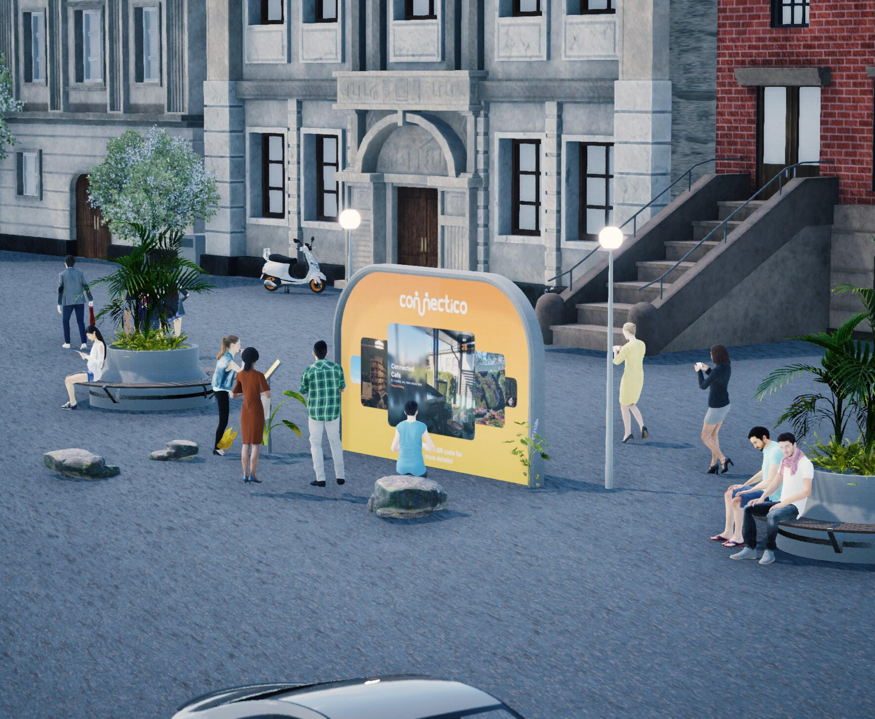
Designed an interactive public installation ecosystem that encourages spontaneous connection among strangers in Sydney’s urban spaces.
Role
UX Researcher, UI Designer
Tools
Figma,
Twinmotion
Deliverables
Interactive Prototype, Concept Design & Proposal
Duration
6 weeks
Context
Social isolation is a growing issue in dense urban environments, where people often share physical space but lack meaningful interaction. Connectico was developed as a semester-long design project to explore how portable, technology-enhanced installations could foster social engagement in public settings.
Process & Approach
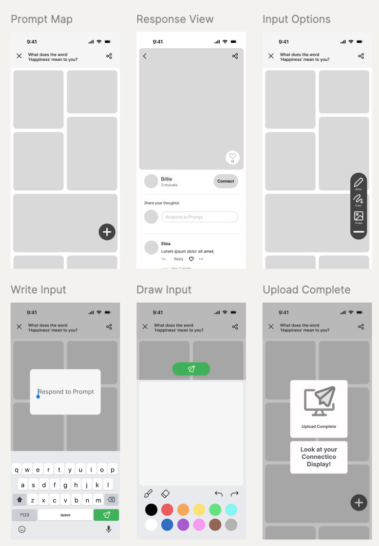
• Conducted field research, online ethnographies, and observational studies to understand barriers to urban connection.• Mapped behavioural insights into opportunity areas and ideated concepts for inclusive, low-barrier interaction.• Developed task flows, service blueprints, and experience prototypes focused on playful, curiosity-driven engagement.• Iterated through user testing to refine interaction affordances, accessibility considerations, and installation touchpoints.
Outcome
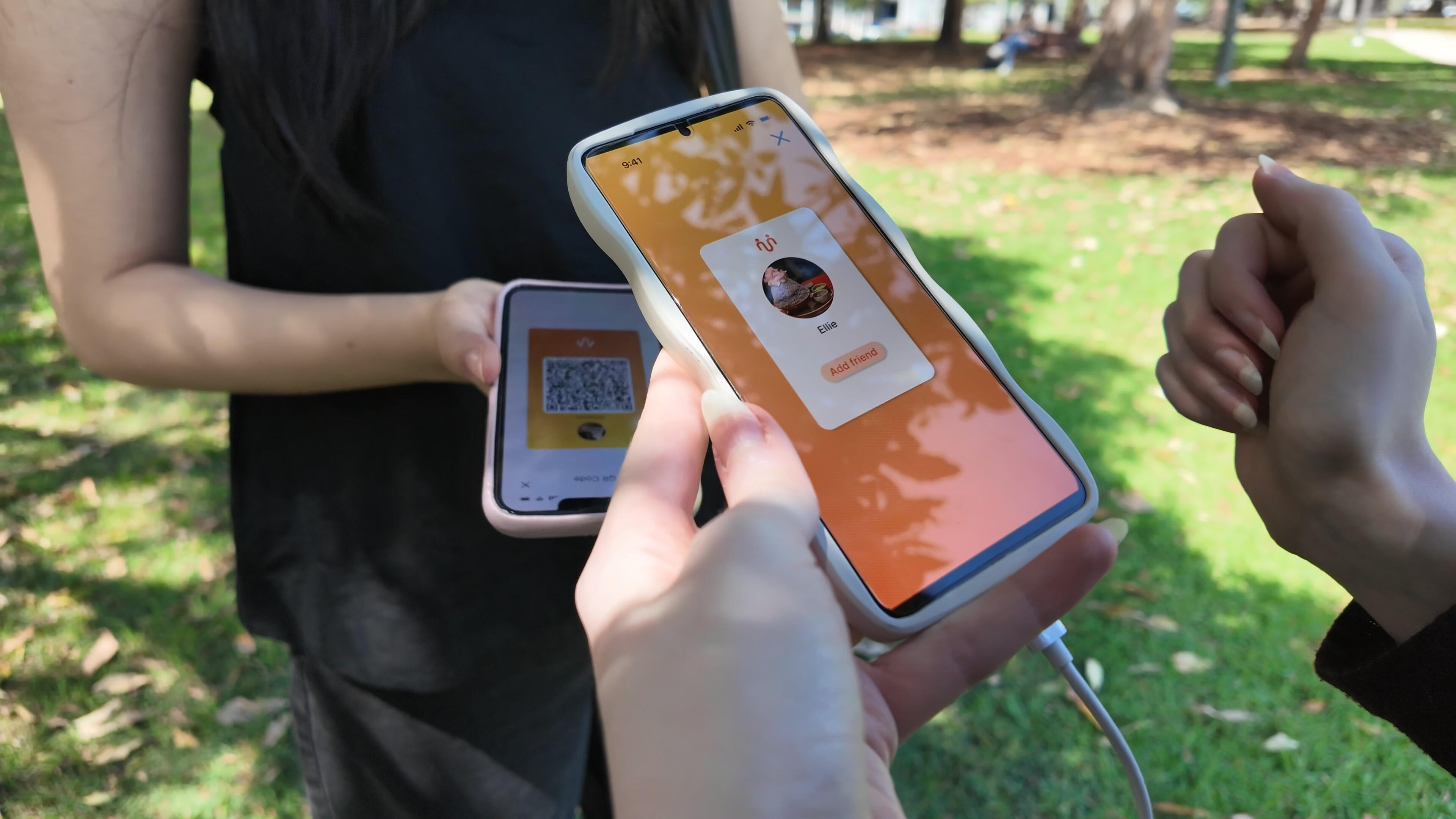
Connectico demonstrates how considered UX research and experience design can reshape communal spaces, creating moments of connection in environments where people often feel anonymous and isolated. The project highlights my strengths in research-driven design, prototyping, and designing for real-world social contexts.
Key Learnings

Human Behaviour Matters
Small interaction cues can dramatically influence a person’s willingness to engage with strangers.

Prototype Early
Physical and digital prototypes revealed usability issues not visible in sketches or storyboards.

Design for All
Public installations require accessibility, durability, and universal design thinking from the outset.
© Sarah Samarasinghe 2025. All rights reserved.
ASV Parts Group Brand Concept
Developed a new parent brand identity, ASV Parts Group, to unify and future-proof ASV’s diverse business divisions.
Role
Graphic Designer
Tools
Adobe Illustrator
Deliverables
Logo, Brand Identity, Store Concept Design
Duration
1 week
Context
ASV Euro Car Parts sought to expand into new sectors: mechanical, electrical, lubricants, logistics, tools, vehicle sales and hire, while maintaining the equity of their established brand. A parent identity was needed to house current and future subdivisions, communicate diversity, and support clearer organisational structure without losing ASV’s recognisable heritage.
Process & Approach
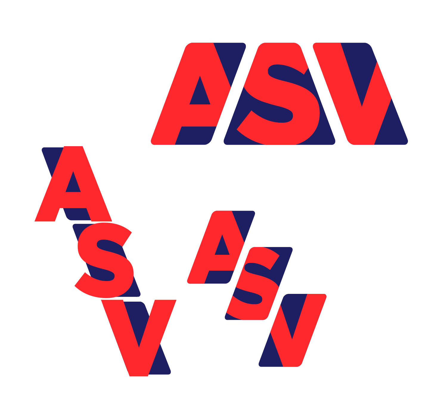
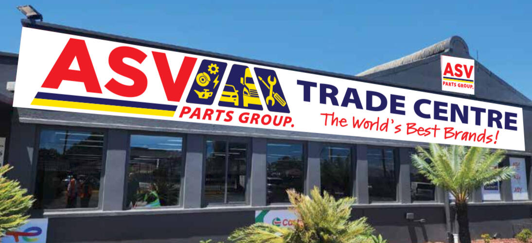
• Explored typographic direction and brand architecture strategies rooted in ASV’s existing identity.• Designed a descriptive horizontal logo for external communication and clarity across varied industries.• Created a simplified, stacked variant for internal signage, installations, and compact applications.• Balanced boldness and recognisability to ensure the new brand stood out while remaining connected to the original ASV identity.
Outcome
The ASV Parts Group identity provides a scalable, modern framework that supports business growth while preserving the trust associated with ASV Euro Car Parts. The new branding strengthens recognition, aligns diverse subdivisions under a unified system, and sets the foundation for future strategic expansion.
Key Learnings

Brand Architecture
Creating a parent identity requires clarity, hierarchy, and a strong link to existing brand equity.

Consistency vs Flexibility
A successful visual system must allow expansion across industries without losing coherence.

Practical Application
Testing logo variations across real environments (signage, digital, print) ensures usability and longevity.
© Sarah Samarasinghe 2025. All rights reserved.
Qwota Website Design & Development
Designed Qwota, a SaaS dashboard that helps facilities managers identify environmental vulnerabilities, reduce sick-leave–related losses, and plan targeted improvements to Indoor Environmental Quality (IEQ).
Role
Web Developer, UI Designer, Data Researcher
Tools
Figma, HTML, Javascript, CSS, VSCode, Plotly
Deliverables
SAAS Dashboard Website, Web Prototype
Duration
6 weeks
Context
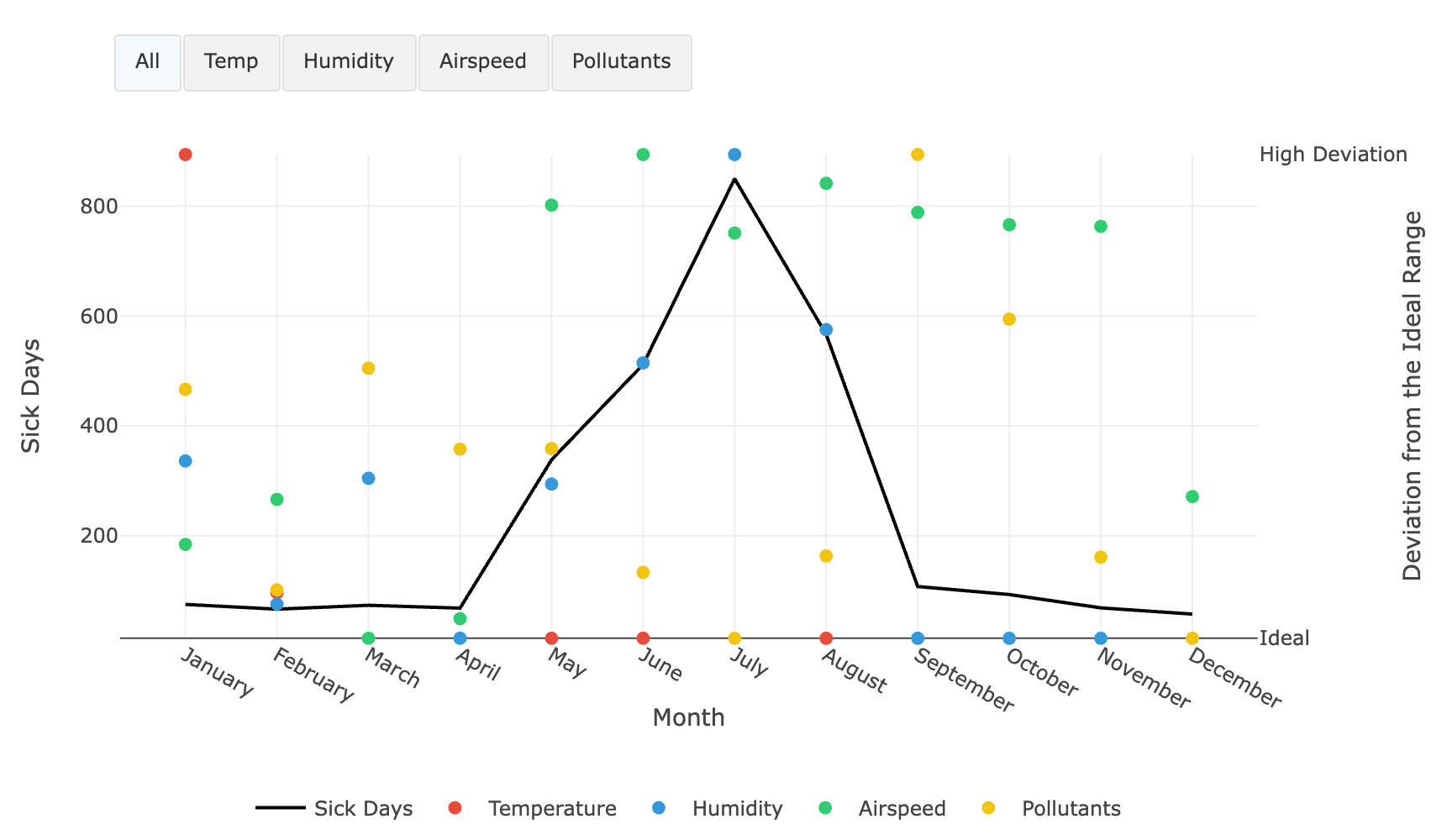
Office environments are heavily influenced by seasonal and environmental changes that can increase short-term illness and employee absenteeism. Facilities managers often lack clear, actionable insight into how IEQ fluctuations impact health, budget, and operations. Qwota was developed to provide an intuitive, data-driven tool that reveals risks, monitors performance, and guides strategic decisions across weekly, quarterly, and yearly timelines.
Process & Approach
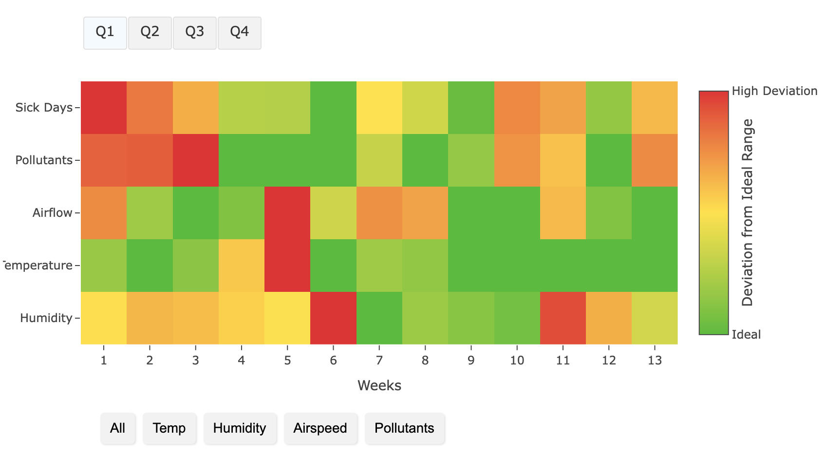
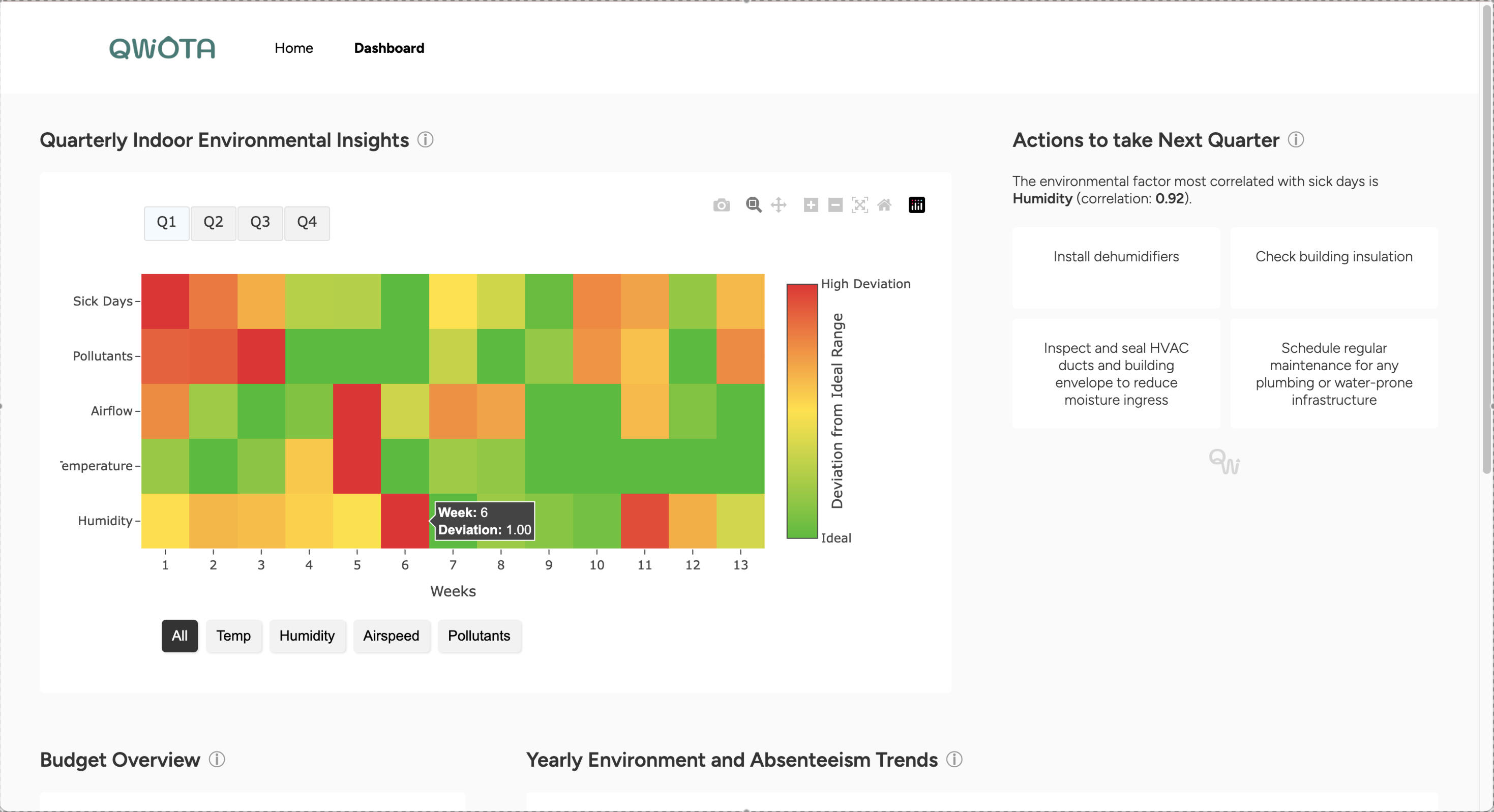
• Mapped a full end-to-end workflow for facilities managers, creating four interconnected dashboard components: Quarterly Monitor, Budget Monitor, Yearly Monitor, and Next Quarter Action Panel.• Framed the visualisation around deviation from ideal ranges, making risks immediately visible and eliminating noise from raw data values.• Combined fortnightly IEQ data (humidity, globe temperature, airflow, pollutants) with AI-derived sick-day projections to uncover correlations and seasonal patterns.• Iterated on feedback by removing redundant views, unifying weekly and quarterly insights, adopting a professional grid layout, and adding tooltips for clarity.• Designed the interface to support both short-term tasking and long-term strategic planning, integrating narrative annotations and clear risk highlights.
Outcome
Qwota allows facilities managers to confidently assess IEQ patterns, understand their connection to employee sick leave, justify budget allocations, and take decisive action. By blending clear visual narratives with aligned recommendations, the dashboard supports both immediate problem-solving and long-term planning. It transforms raw environmental data into an accessible story that empowers managers like Geoffrey to maintain healthier, more productive workplaces.
Key Learnings

Clarity Through Deviation
Showing deviation surfaces risks faster than raw data and supports stronger decision-making.
Iterative Refinement
Consolidating redundant layers and improving layout drastically increases interpretability for non-technical users.

Insight to Action
UX for data dashboards must bridge information and decision. Visuals alone aren’t enough without clear next steps.
© Sarah Samarasinghe 2025. All rights reserved.
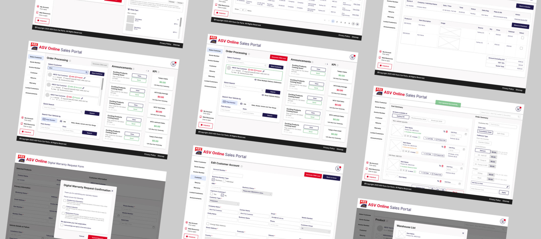
ASV Sales Portal Redesign
Redesigned ASV’s internal sales portal to streamline navigation, improve clarity, and support faster, more accurate sales processes.
Role
UX & UI Designer
Tools
Figma
Deliverables
Internal Sales Portal Redesign
Duration
2 weeks
Context
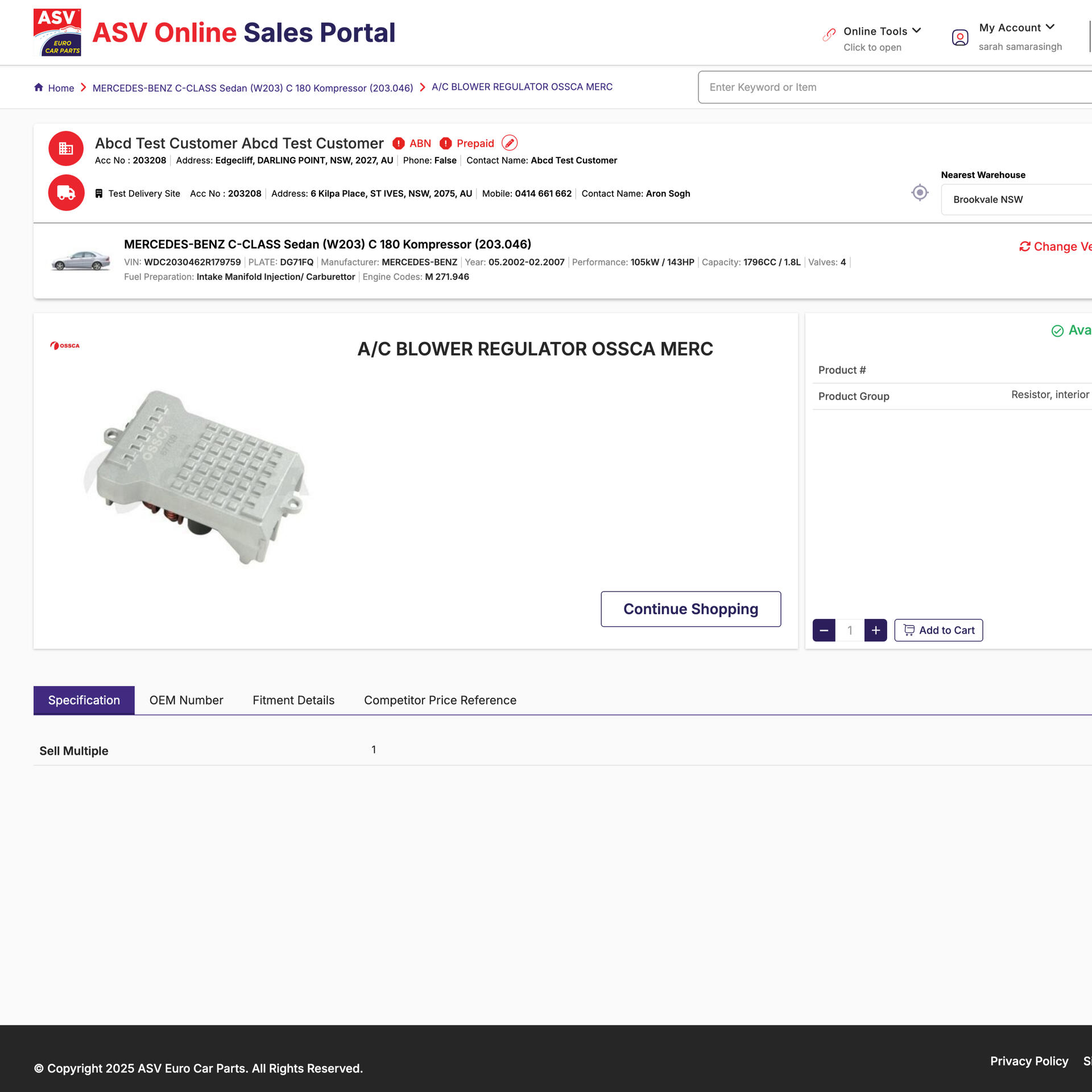
ASV’s existing sales portal had become outdated, inconsistent, and difficult for the sales team to navigate. Inefficient flows and unclear interfaces led to slower sales cycles and increased errors. The goal was to modernise the portal’s UX/UI while retaining the underlying structure and integrations essential to ASV’s operations.
Process & Approach
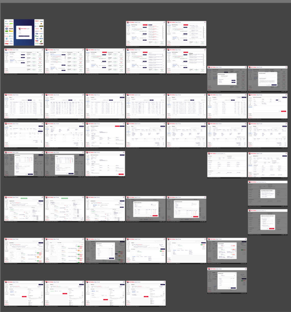
• Conducted UX analysis of the existing portal to identify friction points affecting speed, accuracy, and task completion.• Redefined the layout and key workflows to reduce cognitive load and improve findability of tools and information.• Developed a clean, consistent UI system that aligned with ASV’s internal brand guidelines and supported scalable component use.• Created 46 high-fidelity Figma screens covering dashboards, product entry, quoting, customer lookup, and internal actions.• Collaborated closely with the development team, providing detailed handoff notes to ensure accurate implementation of interactions, components, and responsive behaviour.
Outcome
The redesigned portal offers a cleaner, more intuitive experience that supports faster quoting, easier navigation, and fewer mistakes. By modernising the interface and optimising task flows, while respecting existing integrations, the updated design equips ASV’s sales team with a more efficient and reliable tool for everyday operations.
Key Learnings

Designing Within Constraints
Working with legacy systems requires creative problem-solving and strategic simplification.

Consistency Accelerates Workflow
A unified UI and clear hierarchy can significantly reduce user error in high-volume tasks.

Cross-Team Collaboration
Clear communication with developers is key when redesigning mission-critical internal tools.
© Sarah Samarasinghe 2025. All rights reserved.
Eastern Suburbs Automotive Website
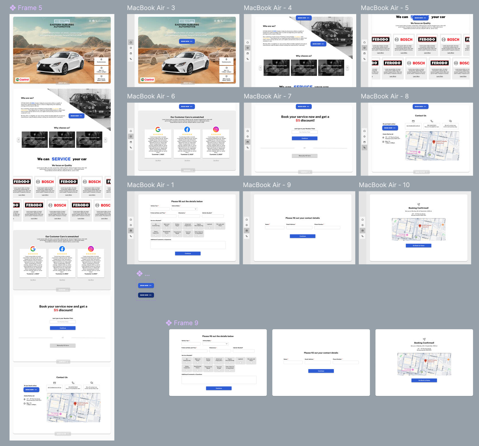
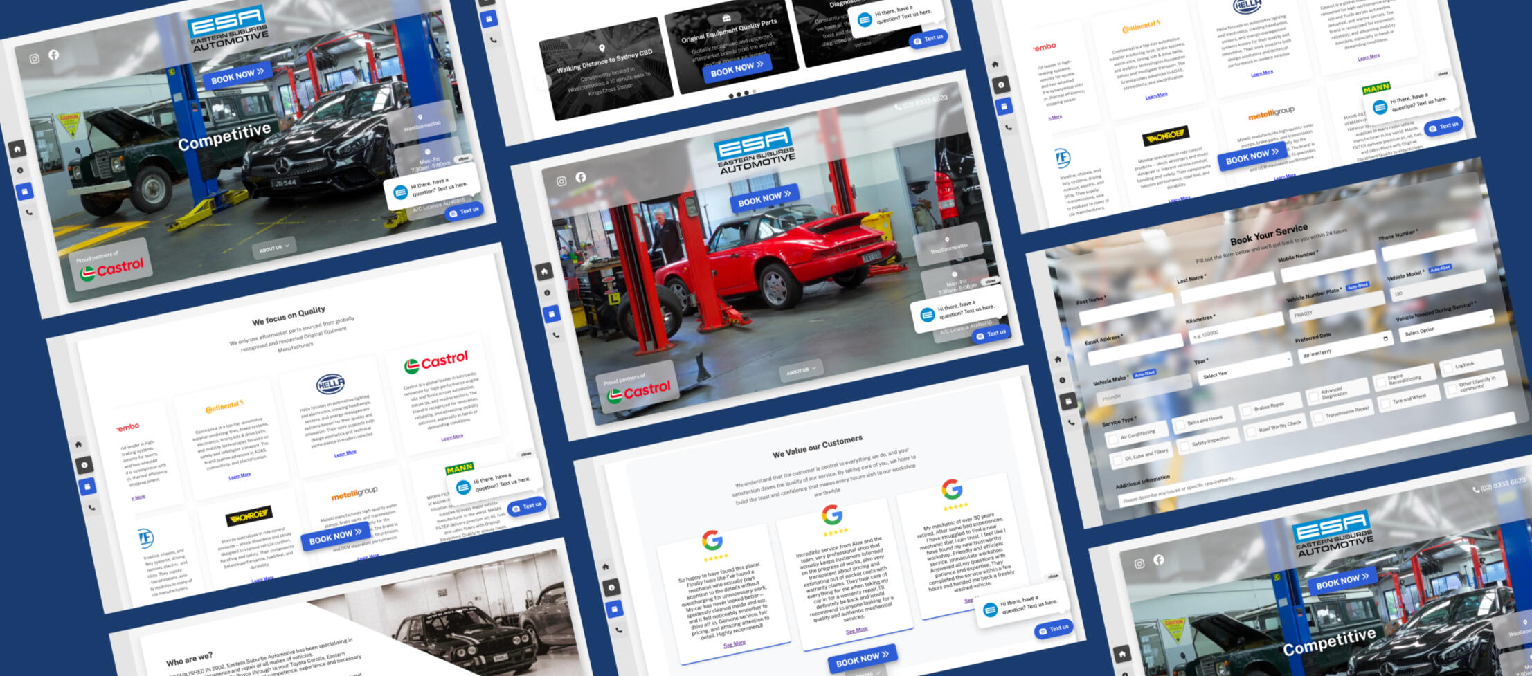
Redesigned and rebuilt Eastern Suburbs Automotive’s website to modernise their digital presence and streamline service bookings through an automated, user-friendly online system.
Role
Web Developer, UI Designer
Tools
Figma, HTML, Javascript, CSS, pHp, cPanel, VSCode
Deliverables
Responsive Website, Web Prototype, Booking Handler
Duration
2 weeks
Context
Eastern Suburbs Automotive relied heavily on phone enquiries, resulting in slow bookings and inefficiencies for both staff and customers. Their outdated website lacked engagement, clarity, and functional booking pathways. The goal was to create a modern, high-performing site that encouraged online conversions while automating key workshop processes.
Process & Approach
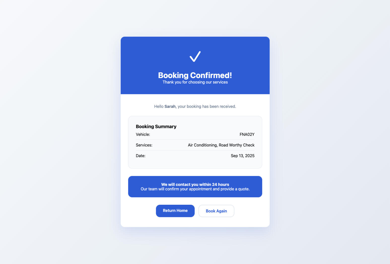
• Designed a sleek, modern interface using side navigation, sticky scrolling, and a dynamic video hero section to increase engagement.• Implemented clear, repeated calls-to-action across a single-page architecture to guide users toward booking.• Built an automated booking handler where users enter their number plate, validated through an API.• If matched, the system dynamically pre-fills vehicle make and model, reducing friction and improving accuracy.• Collected essential service details and automatically included VIN/engine data in the confirmation email sent to the workshop.• Designed a confirmation flow with directions to the centre and triggered dual notifications: one to the customer and one to the workshop.
Outcome
The redesigned site provides a streamlined, automated booking experience that shifts customer behaviour from phone enquiries to online submissions. With dynamic vehicle verification, integrated notifications, and a modern interface, Eastern Suburbs Automotive now has a reliable, conversion-focused digital platform that supports both customer convenience and operational efficiency.
Key Learnings

Automation Improves Accuracy
Dynamic data validation significantly reduces booking errors and admin overhead.

UX Drives Conversions
Clear CTAs, smooth flow, and reducing cognitive load resulted in higher online booking uptake.

Modern Visuals Matter
A refreshed aesthetic can meaningfully enhance trust and professionalism in service-based brands.
© Sarah Samarasinghe 2025. All rights reserved.
Graphic Design

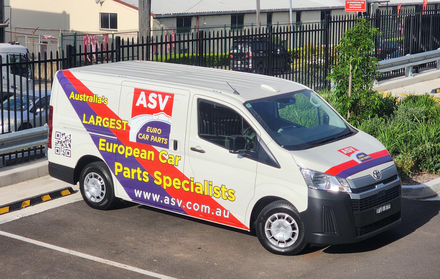
Van Wrap

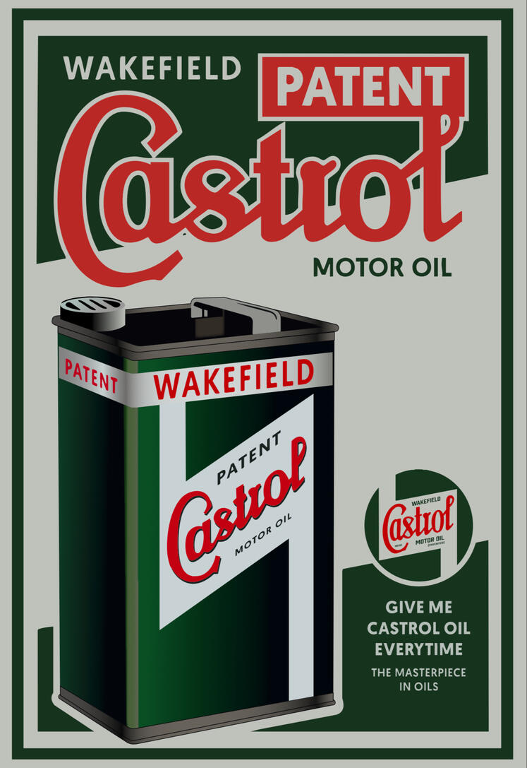
Poster Restoration

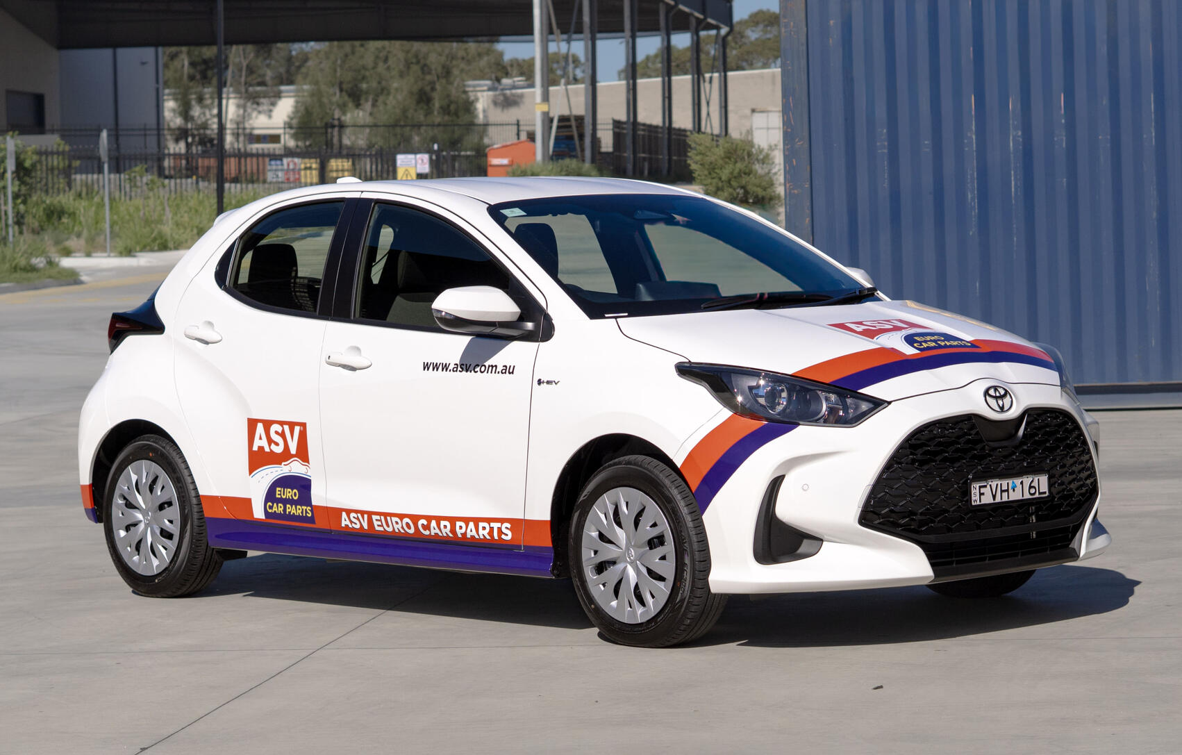
Car Wrap

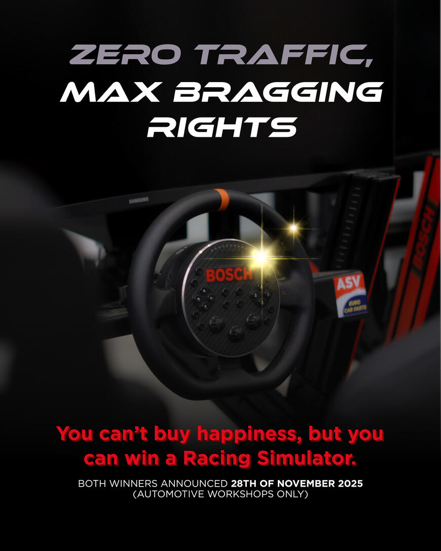
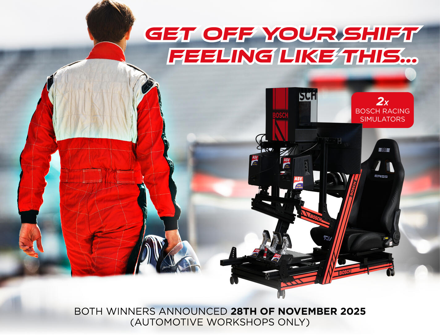
Social Media Campaigns

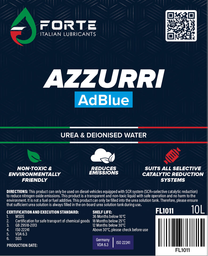
Product Label Design

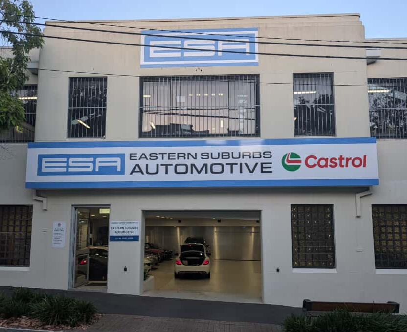
External Signage

Social Media Campaigns
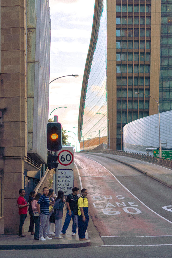
Photography
Illustration


